|
|
Post by hironakamura on Jan 8, 2009 8:26:47 GMT -5
8/10
+ 8 For pics and glow.
-2 Cause the pic on the left looks weird with the ice right by his eye.
|
|
|
|
Post by solidus on Jan 8, 2009 10:56:02 GMT -5
10/10
Looks generally bad ass
|
|
|
|
Post by aubrey on Jan 8, 2009 20:23:06 GMT -5
9 // 10
+ however many you want 'cause there's a monkey
+ 8 'cause the pictures accurately match the phrase
+ 2 'cause I like the background and the avvies in their respectful phrames
- 1 'cause I don't really like the celeb claim.
|
|
|
|
Post by Ira Grey on Jan 9, 2009 11:59:27 GMT -5
10 // 10
+8 because I like the color scheme
+1 because I like the falcon
+1 because I like the quote.
|
|
|
|
Post by william on Jan 21, 2009 5:16:36 GMT -5
8 / 10 + 7... the pics on David are really good quality! He's totally hot in that, makes me wanna turn just for him lol + 1... I love the icies in the background, they're awesome. - 2... could have possibly added a quote to fill in the gap? Generally though, I really like the colouring... very cold  |
|
|
|
Post by issy on Jan 21, 2009 8:18:21 GMT -5
9/10
Just creepy!
|
|
|
|
Post by blaze21 on Jan 21, 2009 10:00:51 GMT -5
Doesnt want to rate the last one. Doesnt know what to rate it. I do suggest ot make it a bit of a brighter background. Its kinda dark. Too dark for the bright letters of "Issy".
|
|
|
|
Post by soveliss5 on Jan 23, 2009 10:35:17 GMT -5
10/10
What can I really say, I can't see anything wrong with it.
|
|
|
|
Post by tracy on Jan 23, 2009 15:47:32 GMT -5
9||10
+ 9 Because the general look is kinda cool
- 1 Because it looks kinda blurry
|
|
|
|
Post by william on Jan 24, 2009 1:46:37 GMT -5
7 outta 10 + 7 = Has some really good pictures and effects, and the icy blue colour is totally her. - 2 = It looks the same as all your other characters  - 1 = The quote under her name... is totally cheesy lol |
|
|
|
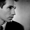
Post by katie on Jan 25, 2009 18:32:38 GMT -5
9|10 + 9 Because it's Johnny Depp of course - 1 Because you don't get to see all of his lovely face And yes, I know, its cheesy - but I don't care. LOL. And I like having smaller pics -- but I do try to make some of my banners slightly different - sometimes lmao |
|
|
|
Post by soveliss5 on Jan 26, 2009 2:51:48 GMT -5
9.5/10
+9.5 Cause it works with her power
-0.5 Cause the pic on the right looks cut off
|
|
|
|
Post by maiwolf on Jan 26, 2009 21:23:52 GMT -5
Uerm...
7.5 // 10
+ however many (6 I suppose) ;; his face is priceless
+ 1.5 ;; quote is okay
- .5 ;; quote doesn't match the random facial expression
-2 ;; I dunnot like hs name like that. It seems to random.
|
|
rocky
New Member

Posts: 0
|
Post by rocky on Jan 27, 2009 23:29:56 GMT -5
10 // 10 +7 the overall look is very good + 2 sylars in it + 2 riley looks cute in it :0) - 1 elle aka big sis is not in it - 1 you should make a dog in there instead of the lamb since your zodiacs a doggy  + 3 the text stye is awsome and i like how you positioned it - 3 its a little big tho that might just be me. + 1 the moving riley looks like shes chasing after sylar lol "no wait for me sylar i have coffee" well now that thats done i just made a whole bunch of new thingys for ray so i wanted to get some feed back. if you have the time to rate the "video" and "souls" links also then i would like that very much but if not then tis ok. THANX |
|
|
|
Post by melissa on Jan 30, 2009 18:57:21 GMT -5
Well you know my views on it already. I'm gonna give it 10||10 because I think the whole thing looks totally pwnsome, but I'd personally like it a little bigger. |
|